Sanko Co., Ltd. has renewed corporate brand logo and tagline.
New corporate brand logo
![]()
Start of use
The new equipment will be used sequentially from April 2022 onward.
Logo Concept
1. shining material + sun, moon and stars
The logo represents the “sun” and the “moon” using the benzene ring, a symbol of chemistry, as a motif.
2. flexibility
The design of the logo, which has no corners and is centered on a wave-shaped mark, expresses flexibility.
3. growth and a behind-the-scenes presence
The company name is written in all lowercase. The company name is written in all lowercase letters to express the company’s ability to grow and to remain strong.
In addition, the placement of the letters below the logo expresses the fact that Sanko (materials) supports society at its core, even if in a small way.
About the tagline
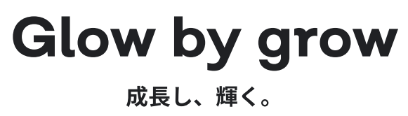
Glow by grow” is the language used to express Sanko’s constant search for growth and its willingness to strive to offer more flexibility and superior materials.